
When dealing with CSS animations, you might encounter issues where the z-index property doesn’t behave as expected. Here are some common reasons and solutions for why z-index might not work properly during animations:
Common Issues with z-index in Animated Elements
- Positioning Context
- Problem:
z-indexonly applies to positioned elements (those withposition: relative,absolute,fixed, orsticky). - Solution: Ensure that the animated element and its overlapping siblings are set to a proper positioning context.
- Problem:
- Animation Properties
- Problem: Certain CSS animations can create a new stacking context, which can affect how
z-indexis applied. - Solution: Review any properties like
opacity,transform, orfilterthat may create a new stacking context. If an element has these properties applied during animation, it may not respect thez-indexof its parent.
- Problem: Certain CSS animations can create a new stacking context, which can affect how
- Default z-index Value
- Problem: If no
z-indexis explicitly set, elements are stacked according to their order in the HTML, which may not yield the desired effect. - Solution: Set explicit
z-indexvalues for all relevant elements to ensure they are layered as intended.
- Problem: If no
- Animation Timing
- Problem: Changes in
z-indexmay not take effect until the animation completes. - Solution: Use animation events (like
animationend) to changez-indexdynamically once the animation is complete.
- Problem: Changes in
- Nested Elements
- Problem: If the animated element is nested within another element that has a lower
z-index, it might not appear above other elements. - Solution: Check the
z-indexof parent elements to ensure they do not restrict the visibility of the animated child.
- Problem: If the animated element is nested within another element that has a lower
- Browser Rendering Bugs
- Problem: Some browsers may have rendering issues with animations and stacking contexts.
- Solution: Test the animation in different browsers and consider using browser-specific prefixes or fallbacks.
Solutions to Improve z-index Functionality During Animation
- Use Transform and Opacity Sparingly: If using
transformoropacity, keep in mind that they can create a new stacking context. Apply them only to the necessary elements. - Set Positioning Explicitly: Always set
positionto ensurez-indexapplies correctly. For example:
#css #animation
body {
height: 100vh;
display: flex;
justify-content: flex-start;
align-items: center;
margin-left: 350px;
}
.wrapper {
animation-name: spinner;
animation-duration: 2s;
animation-timing-function: linear;
animation-iteration-count: infinite;
position: relative;
}
.container {
background-color: red;
width: 200px;
height: 200px;
position: relative;
border-radius: 50%;
}
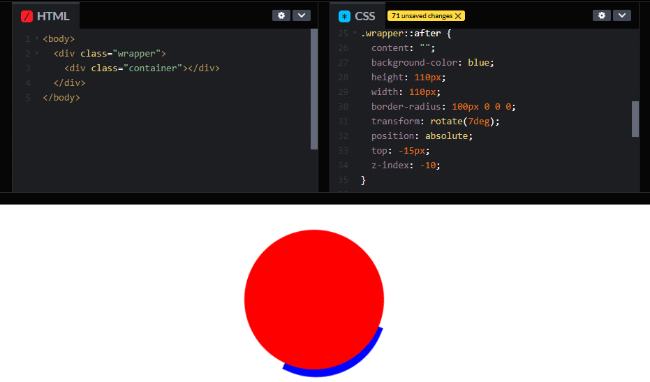
.wrapper::after {
content: "";
background-color: blue;
height: 110px;
width: 110px;
border-radius: 100px 0 0 0;
transform: rotate(7deg);
position: absolute;
top: -15px;
z-index: -10;
}
@keyframes spinner {
0% {
transform: rotate(0deg);
}
100% {
transform: rotate(360deg);
}
}
#css
.wrapper::after {
  content: "";
  background-color: blue;
  height: 110px;
  width: 110px;
  border-radius: 100px 0 0 0;
  transform: rotate(7deg);
  position: absolute;
  top: -15px;
  z-index: 10;
}
Modify z-index in JavaScript: If you are manipulating styles dynamically, consider changing the z-index in JavaScript at appropriate points in the animation:
#javascript
element.style.zIndex = '10'; // Set z-index when starting the animation
Use Animation Events: To handle z-index during animations, utilize event listeners for animationend:
#javascript
element.addEventListener('animationend', () => {
    element.style.zIndex = '10'; // Adjust z-index after animation
});
Use HTML Structure: To handle z-index in layout during animations:
#html
<body>
  <div class="wrapper">
    <div class="container"></div>
  </div>
</body>
By understanding these issues and implementing the solutions, you can ensure that your animated elements layer correctly with z-index.
Find out how the best website design firm can make your online presence stand out. From responsive designs to e-commerce integration, our top web design services make sure your website looks fantastic and runs flawlessly on all devices.
Related Links!
- TranslateY fails with eyelid keyframes, but scaleY works!
- Overlapping Issues with Fixed Elements in Sections!
- Animation of rotateY-180 is not displayed!
- Aligning Gradient Heading and Button on Same Line!
- Creating a Gradient Column in a Table!
Coding Filters Enhance Collaboration in Development Teams!
In team-based development environments, coding filters help enhance collaboration by making code more modular and easier to understand. By using filters, developers can work on different parts of an application without interfering with one another, streamlining the development process and improving team productivity.